
Schedule
visualizer
Processing
On hold...
Data visualization through creative coding.
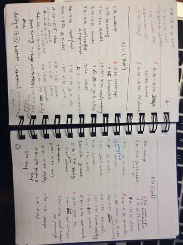
I decided to see how well I can follow a planned daily schedule for two weeks.
On the first day of each week, I planned out the week's schedule with activities, and their start time and end time (e.g. wake up, study, exercise). Throughout the week, I kept track of the time I started and ended the activity on a notepad. After the two weeks, I transferred the data to an excel spreadsheet.
My goal is to map out ...
The difference between the start time of the scheduled activity and the actual start time of the scheduled activity, if there were any delays or advances.
The duration of the scheduled activity to see whether there were activities that I tended to overdo or do less
Substituted activities over the scheduled activities

Initial design sketch


Iterated design
Consolidating the sketches, I drew segmented circles with arcs that represented the amount of time diverted away from the scheduled activity time. The color in the core represents the activity that derived away the most from the respective day's schedule.
Color - activity
Size - duration of delay/advance
Cross - substituted activity


Based on the initial visualization design, time was converted from 12-hour clock to military time, removing the colon sign to provide a range of 0 - 2359 for one day. The conversion was necessary for coding arcs in processing

Currently, I'm building a processing code to draw 3D images of the sketch. I plan to incorporate interactive features with hand motions captured by the built-in
webcam.

